There is also a Nemai Ghosh study of Antonioni admiring his acrylic on canvas piece ‘Rubans Chinois.’ He had always been fascinated by China and when an opportunity occurred to shoot a documentary in China he responded enthusiastically. He produced 220 minutes of calm, poetic footage, offering no facile answers. On its first private screening, the Chinese guests were moved and stood up to tell him, “You, Signor Antonioni, have looked at our country with a very affectionate eye. And we thank you.”
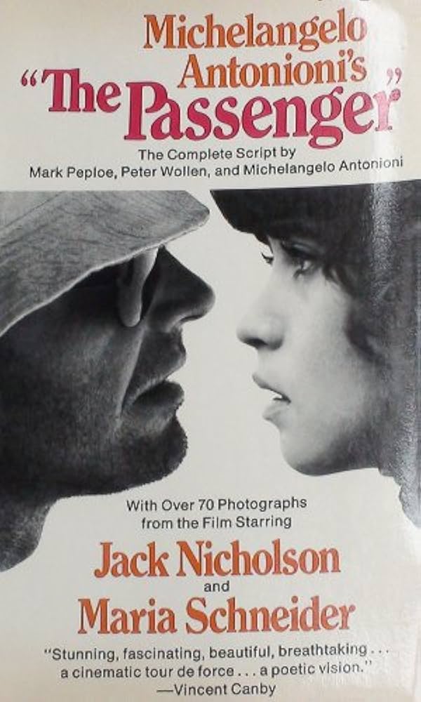
So far so good, Antonioni couldn’t make out what happened thereafter. But the Chinese changed their opinion. It was put out for general consumption that Antonioni had purposely denigrated the country in a host of ways, one of which was to have used a ‘cool’ colour tone to eliminate the real colours of China and the Chinese landscape. Ironically, it was during the several trips to China that Antonioni had stocked up on an endless series of blue shades. Add to them the gold and black backgrounds, the aqua greens, pinks and reds and you have his robust Chinese palette. The use is one of countless proofs that he had carried the palette to his last days. The bitterness, however, caused by the Chinese government criticism lingered in his next film ‘The Passenger’, which his heroine Maria Schneider described as his ‘most desperate’ and ‘without any form of optimism’. Antonioni’s own pained reaction to the Chinese criticism was…
“I want the Chinese to know this: during the war, as a member of the Resistance, I was condemned to death. I was on the other side!”
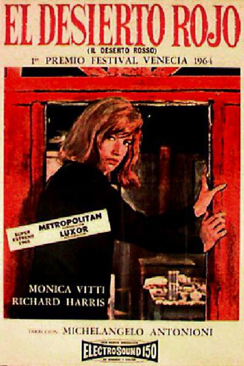
But before we take up the colours, spaces and issues of “The Passenger’ we will return to the master’s debut film in colour ‘Red Desert’.
This 1964 film in colour follows nine extraordinary black and white features which had by then created an Antonioni doctrine of cinematic photography.
Another contemporary master of the black and white features, Satyajit Ray, had by then shot his first colour movie ‘Kanchanjunga’ (1962) for nearly similar reasons.
The first of two reasons for Ray was the opportunity it offered to reflect the personality of each character through clothes; they are identified as much by the clothes as by their behavior—Ray had explained to his biographer Andrew Robinson—making colour a ‘unifying poetic element’ through the patterns it creates over time. The second reason for using colour was to capture the moods of Darjeeling that are integral to the film.
The original title ‘Red Desert’ was ‘Pale Blue and Green’ which was changed because Antonioni thought it didn’t feel strong enough. It was too tied to the idea of colour. The film was conceived, he admitted, in colour, but his main concerns were the ideas that had to be expressed through it. Random thoughts of putting one colour next to some other never really crossed his mind, he told Godard in his ‘Cahiers du Cinema’ interview, but he wanted the grass around the hut to be coloured to accentuate the sense of desolation and death. That involved giving the landscape a certain realism: dead trees were really of that colour.
Dialogues had been reduced to a bare minimum so that a strong link could be established between words and colour. For instance, the scene where there’s talk of drugs and stimulants in the hut. Antonioni had to use red for the scene. In black and white it could never have worked. Red put the viewer into a psychological state that allowed him to accept dialogues of that kind. Antonioni insists it was the right colour for the characters as well as the audience. He also had an anecdote to support his experience and experiment with colour in ‘Red Desert’.
He told Godard in the interview: “I don’t think “Red Desert’ is a finished work, I think it should be thought of as an ongoing piece of research…. I think there’s a relationship between colour and the camera. But one film isn’t enough to fully explore the problem, it has to be carefully studied. I did some really interesting experiments on 16 mm, but I couldn’t use all the effects I discovered in the film.
“There’s a discipline called “psychophysiology of colour’ that studies and experiments with colours. The factory interiors in the film were painted red and in two weeks, the workers on the set had come to blows. The experiment was repeated with pale green, and calm was restored. The workers eyes needed soothing.”
Also Read: Painting Films: Antonioni’s Brilliant Use of Cinematic Colour
In ‘Red Desert’ Antonioni’s idea was to highlight the relationship between the characters and the world around them. For which he had to try and rediscover traces of human feeling buried under a whetter of conventions and gestures. He almost felt like an archaeologist digging through the dry and arid material of the modern age. The digging shows through more clearly in ‘Red Desert’. Where he depicts characters who cannot adapt to their world and provoke conflict.
The world that the characters conflict with isn’t merely the world of factories. Behind the industrial transformation lay a spiritual and psychological one. Contrary to her husband Giuliana—famously played by Monica Vitti—fails to adapt to this new way of life and falls prey to it. In her debilitating neurosis, she attempts suicide. She drives her car into a truck. Antonioni said after the film was made that he had tried to exploit every narrative resource of colour in order to contribute to the mood of each sequence. About the severe crunch of the environment, he reminisced…
“I always thought of ‘Red Desert’ in colour. The idea came to me while travelling across the countryside near Ravenna. I was born in Ferrara, which is about seventy kilometers and for a long time I had frequently travelled back and forth for different reasons but mainly to compete in tennis tournaments. Over the years, I watched Ravenna become the second most important part in Italy after Genoa. The violent transformation of the countryside had a strong effect on me.
Also Read: Nemai Ghosh and Antonioni: Artist capturing Maestro
Once there were vast and beautiful groves of pine trees that today are no longer there. It won’t be long before the construction of factories and artificial waterways will take over the few remaining portions of this once beautiful countryside. This is a good example of what is happening to the rest of the world. That’s why it seemed to be the ideal background for the story I had in mind—which of course had to be a story in colour.”
And what a story in colour it had to be! Monica Vitti as Giuliana is dressed in a green coat to symbolize the fast-fading green of the countryside. In that iconic still, where she stands against the ugly backdrop of the factory, holding her child’s hand she virtually ‘enframes’ the core text of ‘Red Desert’.
How was shooting ‘Zabriskie Point’ in Death Valley different from shooting ‘Red Desert’? Apparently, Los Angeles was chosen because of its proximity to Death Valley. Antonioni had explained that the story had to start in a city not far from the desert. The desert is something very familiar to the people of Los Angeles. Death Valley appealed to him because it was so primitive like the moon. And he did not want to explore its landscape the way people saw it as they passed by. He wanted to put it simply in the background, so that it did not exert too strong an influence on the narrative.
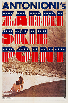
The particular setting of ‘Zabriskie Point’ affected Antonioni’s use of colour, for he seemed to have used it rather differently from what he did in ‘Red Desert’ and “Blow Up’. Antonioni explained the application thus to Marsha Kinder in an interview for ‘Sight and Sound’:
“In ‘Red Desert’ it was subjective. For the most part of the film the reality was seen from the point of view of the woman who was neurotic, so that’s why I changed the colours of the backgrounds, the streets, everything. In ‘Blow Up’ my problem was completely different. … I had just a few exterior scenes in London, and I had to concentrate all my impressions in these scenes. So, I had to decide more or less what was the colour of London not for others but for me. I changed the colour of the streets according to the story, not according to real London. For ‘Blow Up’ it wasn’t really London, it was something like London. In this new film, ‘Zabriskie Point’, I don’t change colours. I try to explore the colours that I have.”
Reams have been written about how even the black and white films of Antonioni exude colour.
The colours observed in the black and white images emerge from camera movements to register moods of loneliness and longing and the telling presence of the surroundings. They are fine harvests of greys within the extreme shifts of black and white.
Such wealth of statement the shades held within themselves that the director refused even to use music to provoke a state of mind in the Adventure.’ He clearly put it across in an interview after the film was screened in France: “What we know to be the use of music in the traditional sense no longer has any right to exist in films. Music is used to provoke a certain state of mind in the spectator. I want the story to do so through its images…. I believe noises were more appropriate for ‘L’ avventura’ than music.”
No wonder, he was so desperate to make a film in colour as soon as he could to instill in images not entirely silence but also a form of visual music. ‘Red Desert’ upheld that shibboleth. But he had to wait a few more decades to actually violate the austerity and isolation of his film style with colour tones to speak out loudly about communion, vibrancy, life and hope. Dr. David B. Kaminsky saw in the exhibition of ‘Silence in Colour’ the maestro’s loud, articulate and poetic farewell to the world through the use of colour.
Image Courtesy: Wikipedia

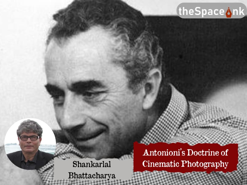
Shankarlal Bhattacharya
Born on 15th August, 1947 in Kolkata, Sankarlal Bhattacharya is a gold medallist in English Literature. He received his training in journalism from Paris, immediately after which be forayed into the world of writing. He has worked as a journalist in the Anandabajar group and has over 130 books to his credit. Aside from short stories and novels, he has written biographies for Ravishankar called "Raag Anurag", for Bilayat Khan called "Komal Gandhar" and has also been the co-writer for Hemanta Mukhopadhyay's memoir "Amar Gaan-er Sorolipi". He has translated widely from Shakti Chattopadhyay's poems to Satyajit Ray's screenplays